
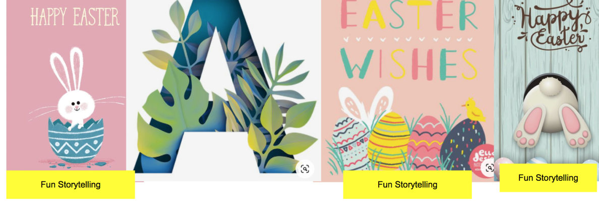
Challenge
The client required a new Easter greeting card design, and the holiday was just around the corner. They needed something fresh and unique within a tight timeframe.
Solution
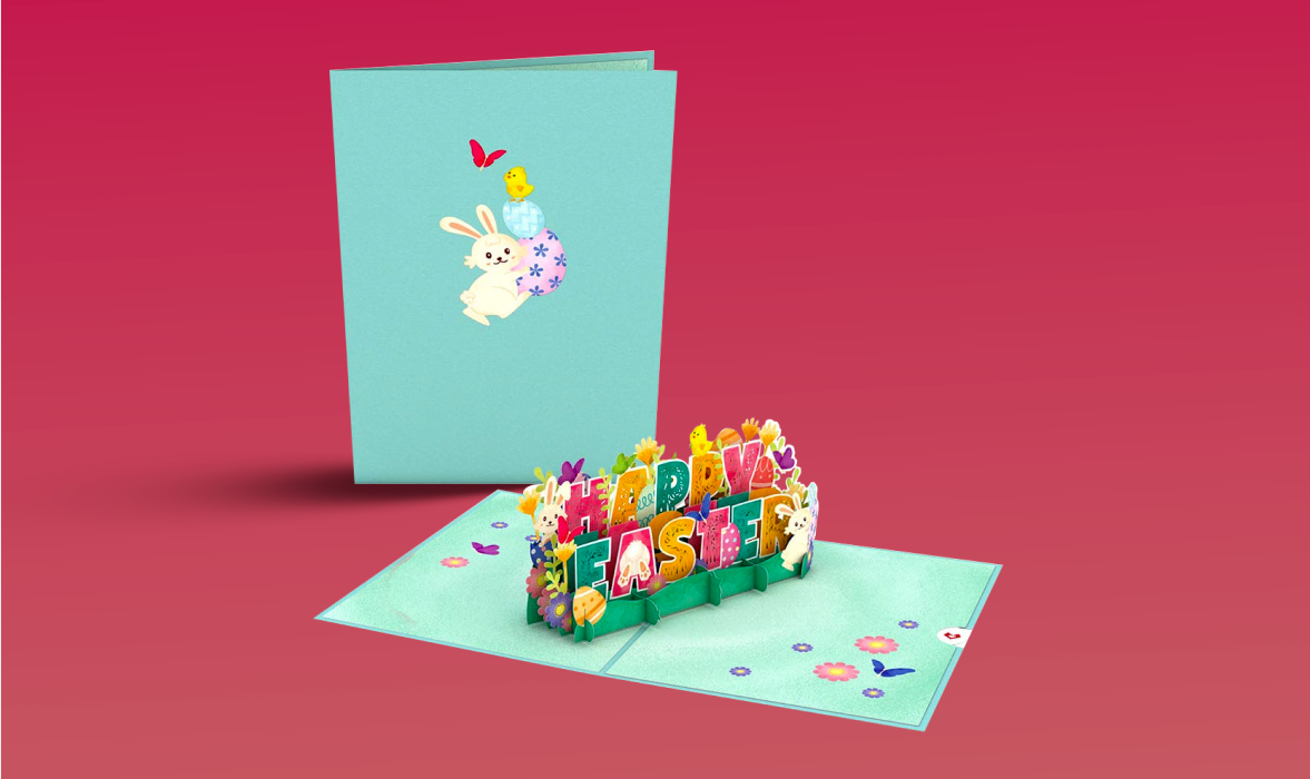
RipeConcepts put together familiar Easter elements in vibrant colors to create a delicately intricate pop-up card.
The client provided a mood board and some notes, giving the team a springboard for the design process. Additionally, our team delved into existing designs and conducted independent research, enriching their understanding of the market. This approach fueled the creation of a refreshingly original design solution.

Process
The design team experimented with different shapes, colors, and mechanisms to create a dynamic and festive design. The team worked closely with the client to implement feedback to ensure the final product captured their vision.
Results
A pop-up card that captured the essence of the season. The vibrant colors contrasted with typical Easter panels, creating a striking effect. The pop-up element itself was beautifully intricate and showcased craftsmanship and creativity.
Client's Testimonial
“RipeConcepts is an incredibly creative place that knows how to get work done.”
Wombi Rose, Founder and CEO, Lovepop