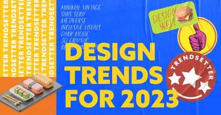
Inspiration is taken from every kid’s favorite arts and crafts activity to create a whole new experience. Contrasting images are put together through “quick-and-dirty cutting and pasting”. Efforts at concealing white outlines and angular edges are non-existent. The dissimilarities in the images are even emphasized rather than hidden.

The collage-style effect walks the fine line between contrast and harmony by bringing varied elements to form to create an unusual but incredibly striking design.

Type Only
Brands will embrace typography as their defining element. And who can blame them? Designers are playing with typography more than ever and have even started to experiment with designs so intentionally ‘bad’ it’s good. Experts believe that typography-heavy designs will continue to dominate in the next decade.


Simple Lines
Line art conjures simple black-and-white drawings, which emerged from the adult coloring books that made a huge splash a few years back. Now line art has influenced brands and design, as it makes conveying complex and overwhelming ideas and concepts easy-breezy.

A flamboyant, in-your-face design is not its aim. This schematic and super simplified illustration style is nostalgic, has a bit of a DIY feel (read: fun!), and is a bit hipster-ish (still fun nonetheless!).

Minimalist Metallic
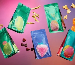
Metallics are no longer reserved for the holiday season. Shiny and shimmering elements will take center stage all year long. As they should, as it gives a luxurious, high-end feel to anything it touches.

Adding a metallic aspect means that the rest of the design is forced to dial down, some to an extremely minimalist extent. Or not, as some rule-bending designers like to exhibit.


