If you’re reading this, you’ve come to the new and improved RipeConcepts website. Welcome!
The web landscape has changed dramatically in the 15 years that RipeConcepts has been in business. Just like fashion trends, websites need a refresh to stay relevant. In a survey, 38.5% of web developers believe that outdated design is a top reason why visitors abandon a website.
So, in between making clients’ websites look good and perform even better, we took the time to revamp our own website, and we’re thrilled to share the highlights with you.
Key Benefits of Our Redesigned Website:
· New Design and Enhanced UI/UX: We’ve completely redesigned the website with a clean, modern aesthetic that’s easy on the eyes but still playful and true to our brand.
· Faster Load Times: Everything under the hood has been optimized for lightning-fast performance, ensuring a seamless browsing experience whether on a desktop or mobile device.
· Expertise On Display: We’re passionate about what we do, and now you can see it in action! We’ve added case studies that showcase the breadth and depth of our digital creative services.
· Talk to the Right Expert: Finding the perfect service for your needs is easier than ever. Connect with the right expert on our team for exactly what you’re looking for. If you're not quite sure what you're looking for yet, you can simply leave a message here.
Behind the Scenes of Web Development
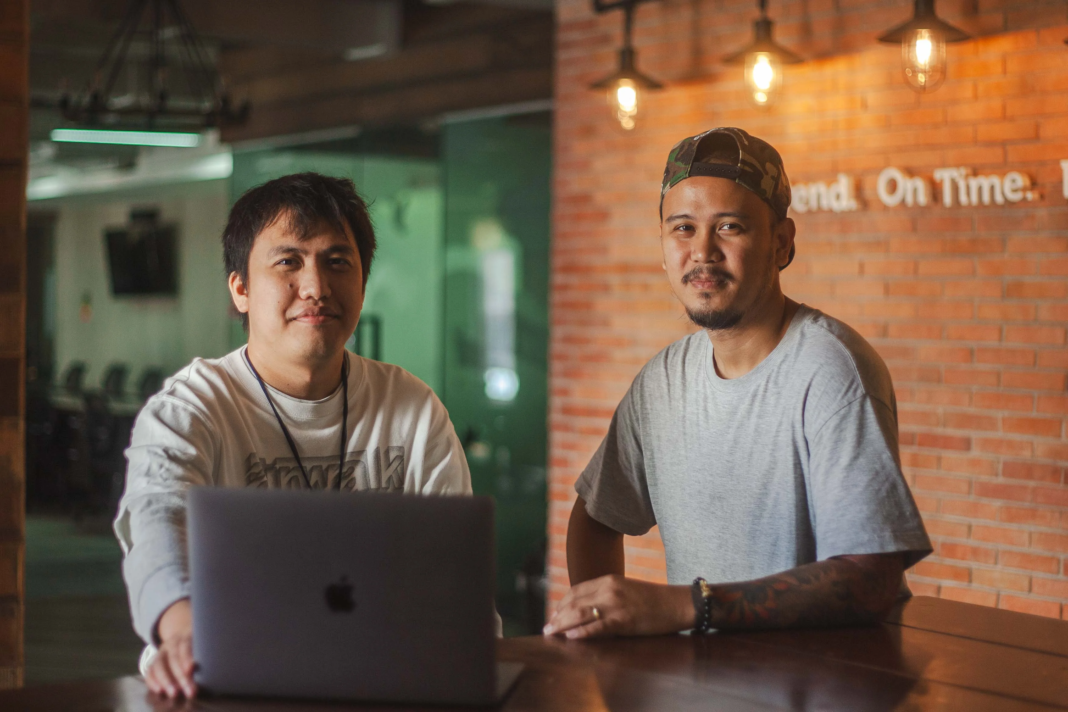
Our website redesign wasn’t just a one-person show! We sat down with developer Hyro and designer Kris to discover the technology and design choices that shaped the new website. Let’s peek at the magic behind the curtain.

From left: Hyro and Kris
1. How did you consider user experience and brand identity in the new website?
Kris: The existing website served its purpose for a while, but it was outdated and very static. The goal was to create a modern, dynamic, and effective website that would provide an improved user experience. As for brand identity, we made a subtle adjustment to the color scheme. While the Ripe orange remained an integral part of the brand’s visual identity, we expanded the palette. This gave us more wiggle room to update the design of the website while still maintaining a connection to the brand’s roots.
Hyro: There was a lot of back and forth among members of the team throughout the process—designing, developing, testing, and more. Everyone was encouraged to share their ideas for what would be best to add to the website.
2. What new languages or frameworks did you use?
Hyro: Astro, to focus on speed and performance for a fast user experience, Angular for its reliability and robustness, and Bulma CSS for lightweight and flexible styling capabilities.
3. Did the revamp involve a new CMS?
Hyro: Yes, we are using Static CMS for its editor-friendly interface, customization, security, and scalability.
4. What were the biggest challenges you encountered?
Hyro: Learning new frameworks had to be the most challenging, but it was fun.
Kris: We powered through it, but creating a design that looks great on both desktop and mobile devices was challenging.
5. Tell us a little bit about how you worked as a team.
Kris: Clear communication was key in making sure everyone was on the same page about the goals. Our Marketing Director, Gov, was awesome at bringing together the perfect team to help us collect all the assets we needed.
Hyro: Everyone had their own roles to play, but we supported each other and frequently touched base and shared our thoughts as we moved along. Good ideas can come from anyone and anywhere.
6. What aspect of the RipeConcepts website are you most proud of?
Hyro: Definitely the speed and performance of the website. We achieved it after a lot of testing for speed, responsive design, and code reviews.
Kris: The case studies. It was nice to revisit some projects we worked on, and seeing some of our best work compiled in one page is pretty cool.
Start Exploring Our Website
The online world is constantly evolving, and so have user expectations for websites. Our new online home ensures we’re delivering the experience that today’s audience deserves. Of course, our work doesn’t stop after this website launch. It’s an ongoing process, and we’re dedicated to making the RipeConcepts site even better over time.
Explore our refreshed website and discover how we can reach your business goals. Browse our services, check out our case studies, and don’t hesitate to reach out to our team – we’re one click away!
Special Thanks
We’d like to thank everyone who contributed to this project—art directors, AEs, Ems, the designers, and especially the Marketing Communication team for putting this together.
Web Development , Web Design


